App Critique Archive is a continuously updated design exercise blog. The purpose of it is to train my sensitivity to user experience design. As a designer and user, I hope to improve my product design thinking further through these exercises.
I recognize that any feature in an app connects to the overall business purposes, product logic, and technical constraints. My observations may not be 100% accurate, but every user’s experience matters.
1. Clubhouse
Feb 21, 2021
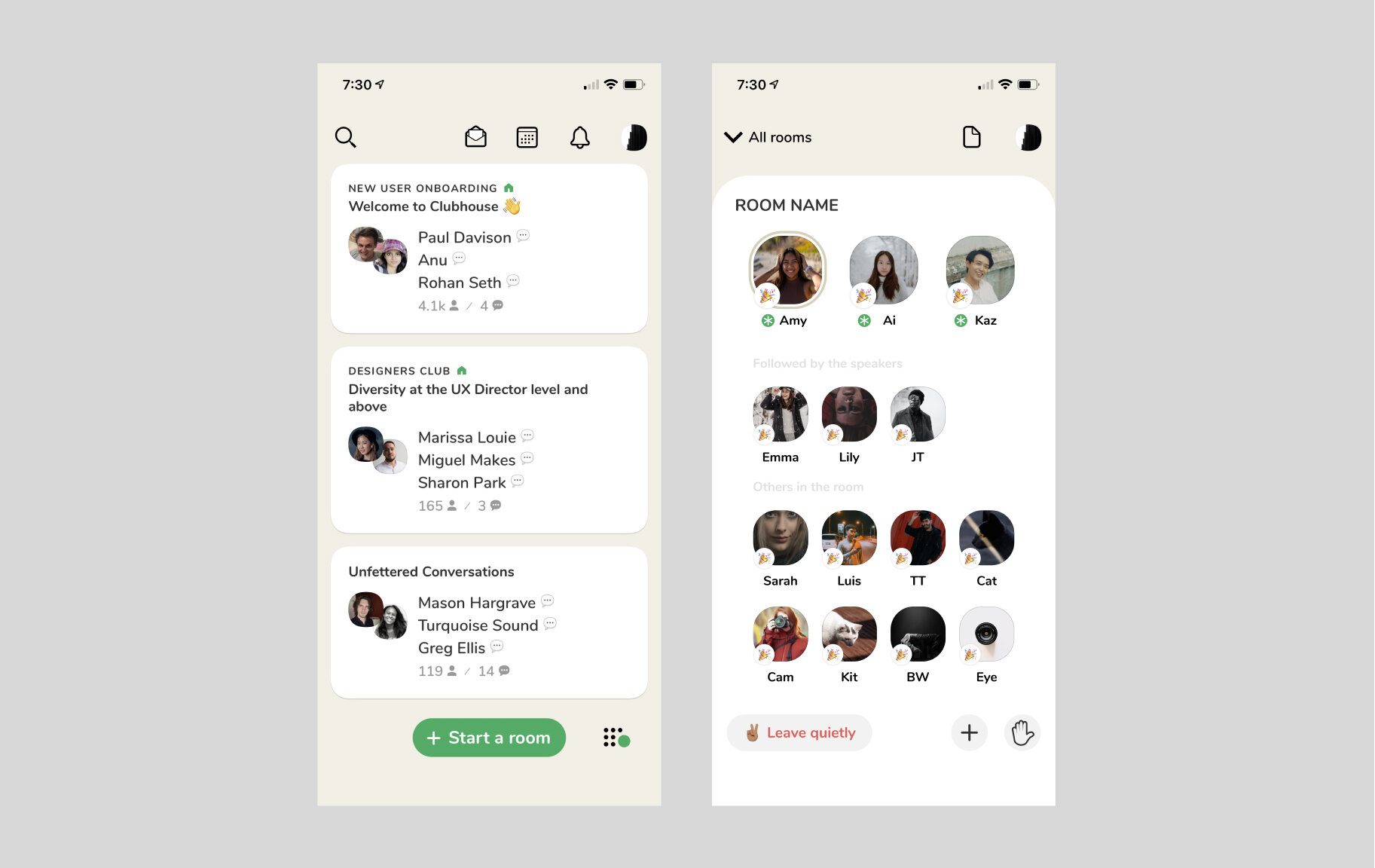
The Problem 🤔️
One of the apps that I have most recently begun using is Clubhouse. After using it for nearly two weeks, I have found that many room topics are very attractive; however, speakers tend to ramble, and speech content is often very long. Usually, I need to pinpoint valuable information among quite a lot of unimportant content or wait a long time to hear topic-related content. Although room subjects only pertain to general discussions, I believe obtaining valuable information within an acceptable time is key to retaining users.
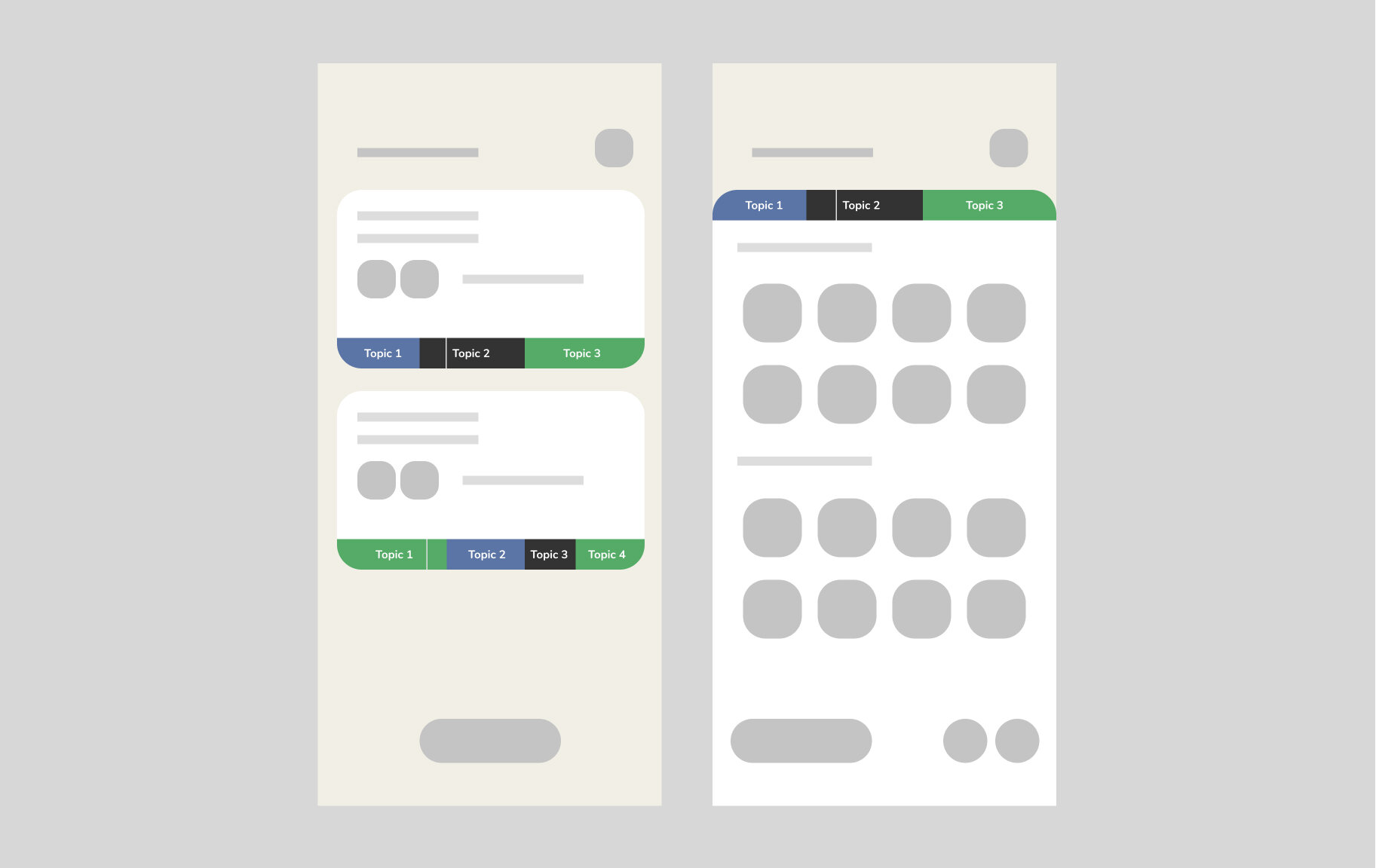
The Maybe
Subdividing room topics may effectively control discussion length and pertinence. Users can select the sub-topic of interest and enter the room at the corresponding time on the preview card. People already in the room can also use this topic progress bar to understand the room schedule.
2. Reminder Apps
Jan 14, 2021
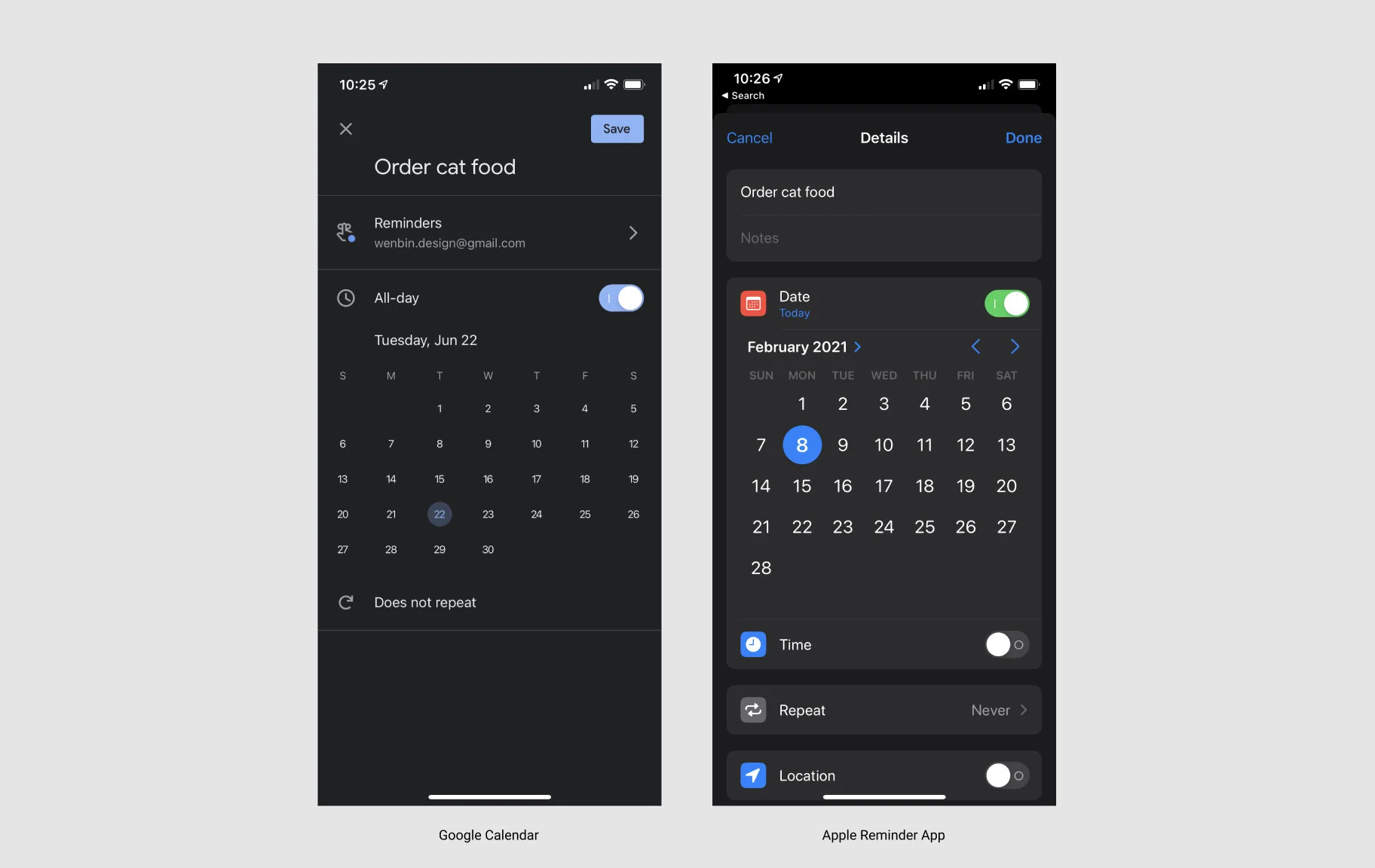
The Problem 🔢
They are Google Calendar and Apple Reminder. When you want to create a reminder, a calendar view is a useful component that can help you set a reminder for a specific date and time. However, if you want to create a reminder to buy food for your cat in 87 days, how many pages do you need to turn back on the calendar?
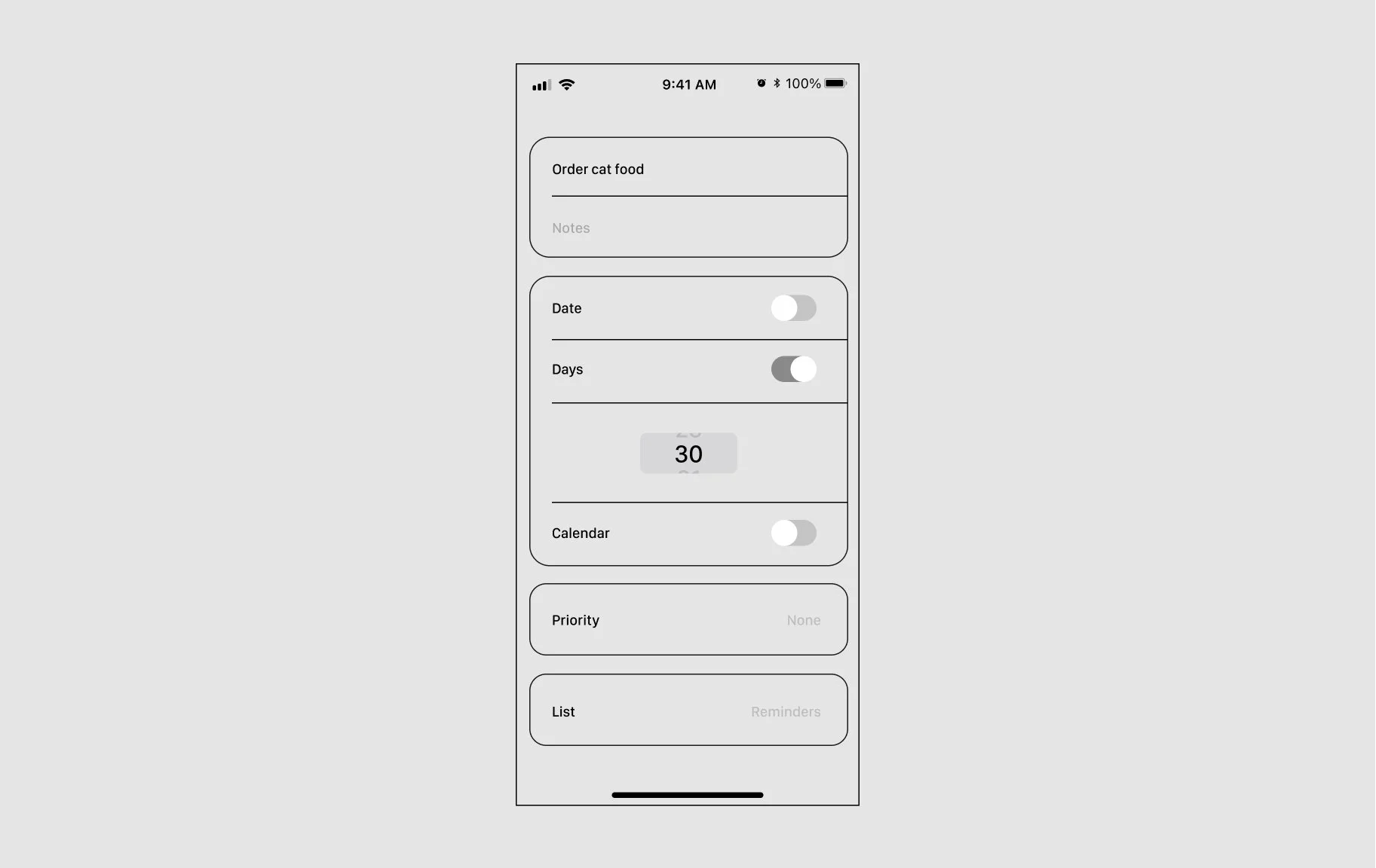
The Maybe
Near the date input location, provide options for the number of days or a non-integer number of days that can be entered manually.
3. DoorDash
Nov7, 2020
The Problem 🍜
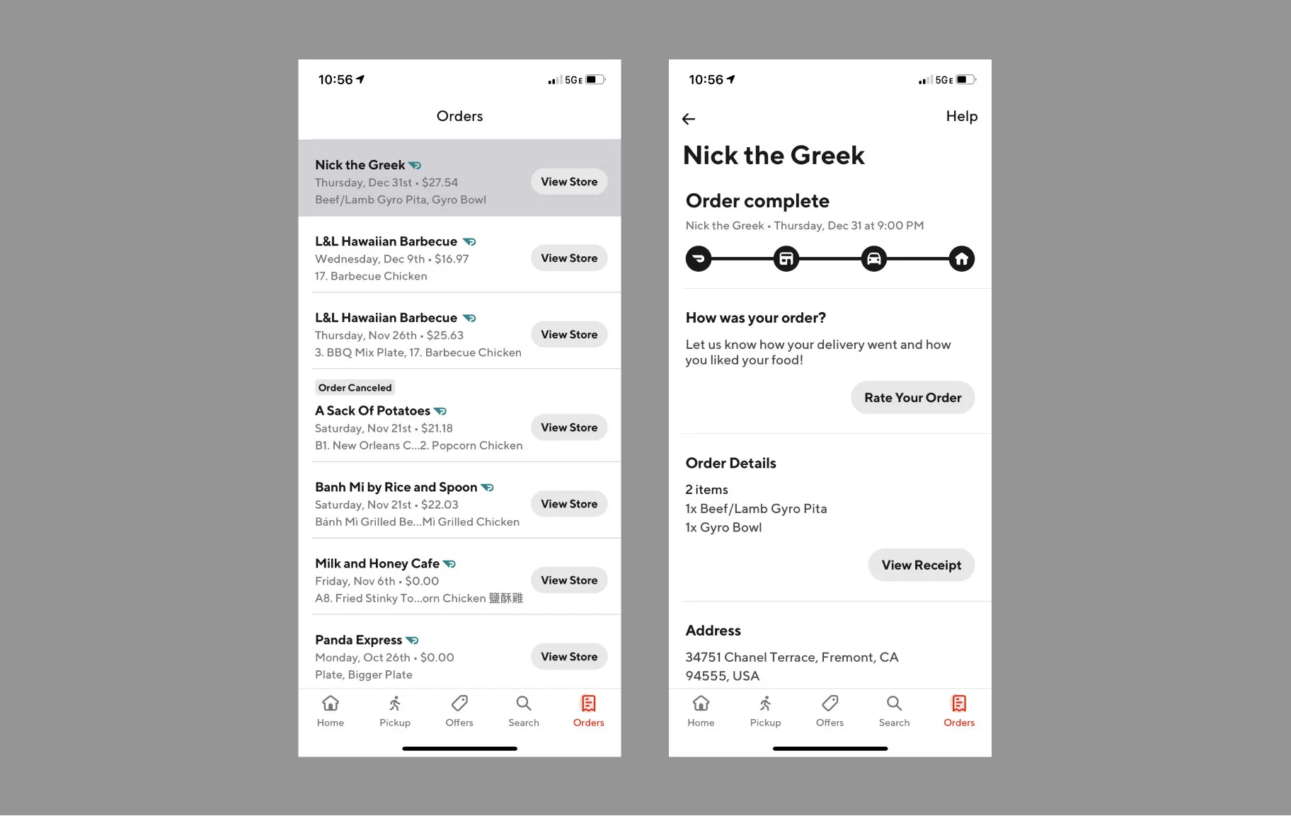
Order history can help users quickly browse restaurants and foods recently ordered. However, suppose a user wants to re-place a prior order. In that case, they must click the "back" arrow, click "view store" to reach the restaurant's profile, and manually find and select the food they previously ordered. For instance, "Large, green tea, 25% sugar level, with jelly, and no boba.” Then, they must customize their drink again, which affects the user's ordering experience.
The Maybe
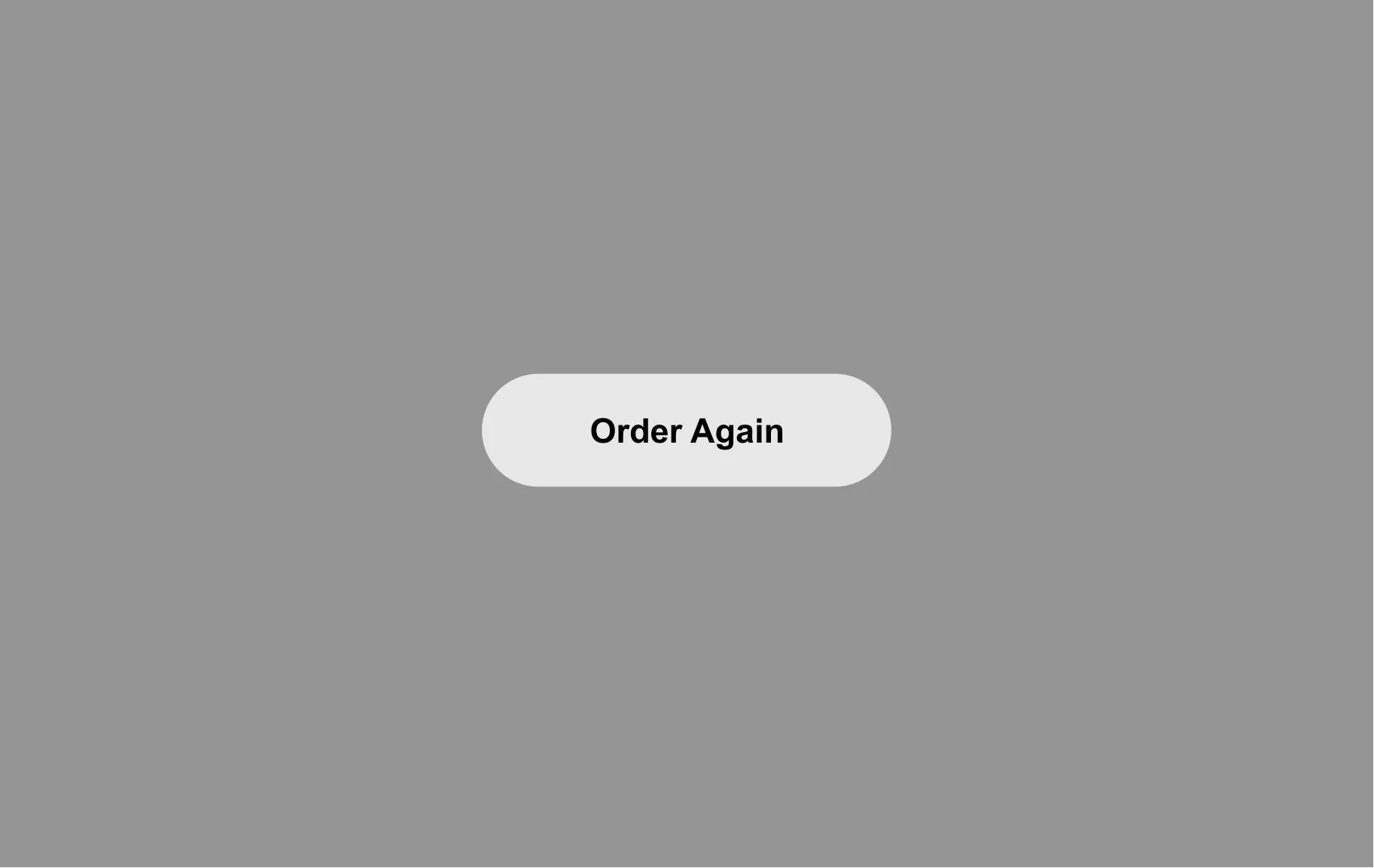
“Order Again”.
4. WeChat
Oct 18, 2020
The Problem 6️⃣0️⃣
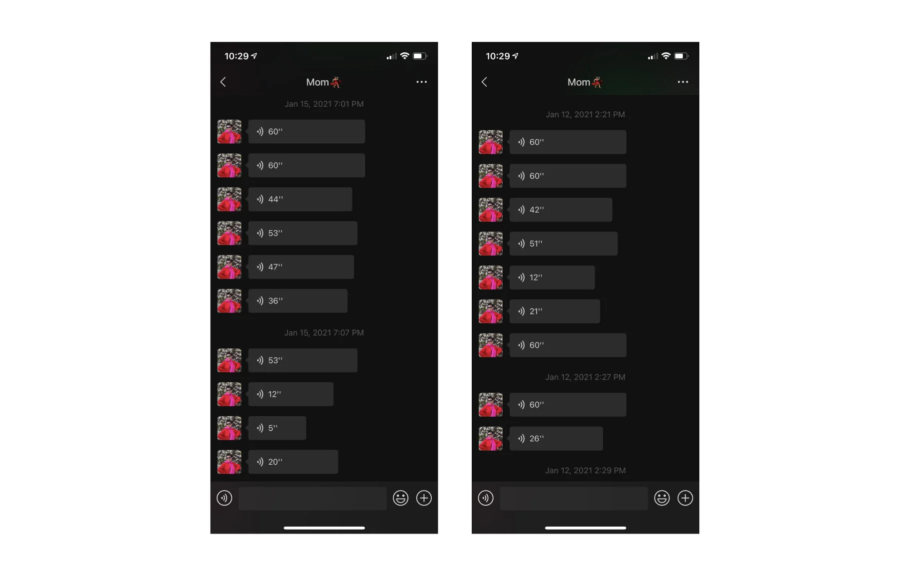
Many people like to send voice messages for nearly 60 seconds at once on WeChat—including my mom. WeChat updated the “voice-to-text” function last year, but this seems to be a function that is not particularly user-friendly for those with accents. Once you have lost some information while listening to a 60-second voice message, you need to listen to it all again. This ends up being the longest 60 seconds you have ever had.

The Maybe
Offer users greater control to produce more efficient outcomes.