OP Workspace
OP Workspace is a global co-working space born in Silicon Valley, California. OP is committed to innovating the traditional office space model by providing flexible space solutions for teams of all sizes. Through its strong community network, it enables teams to connect with innovative talent and inspire them.
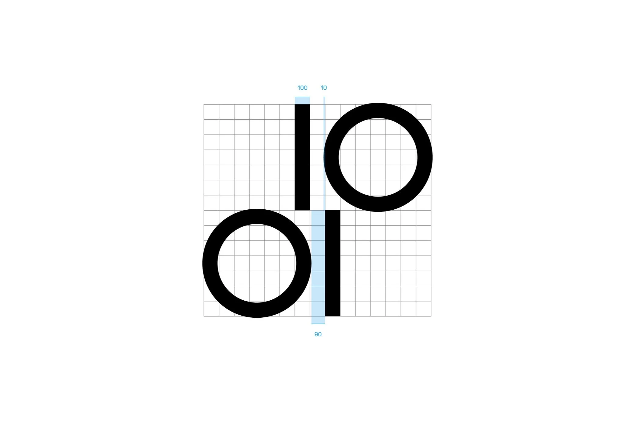
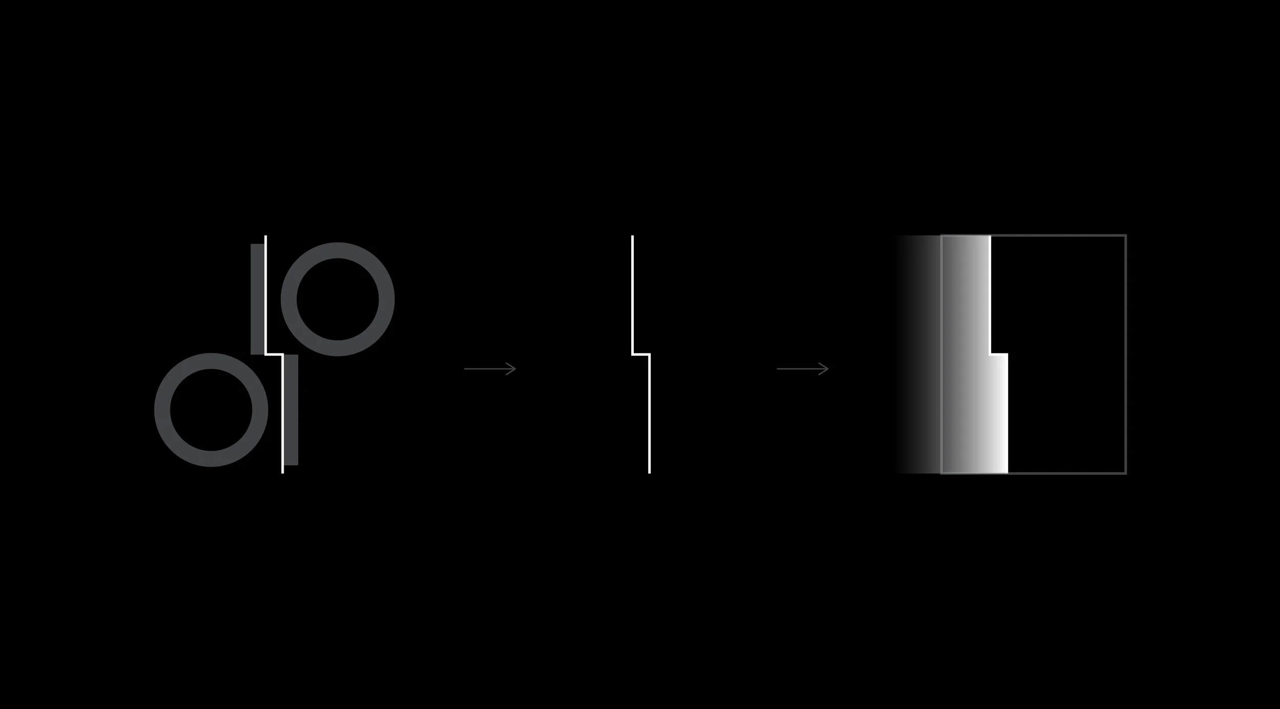
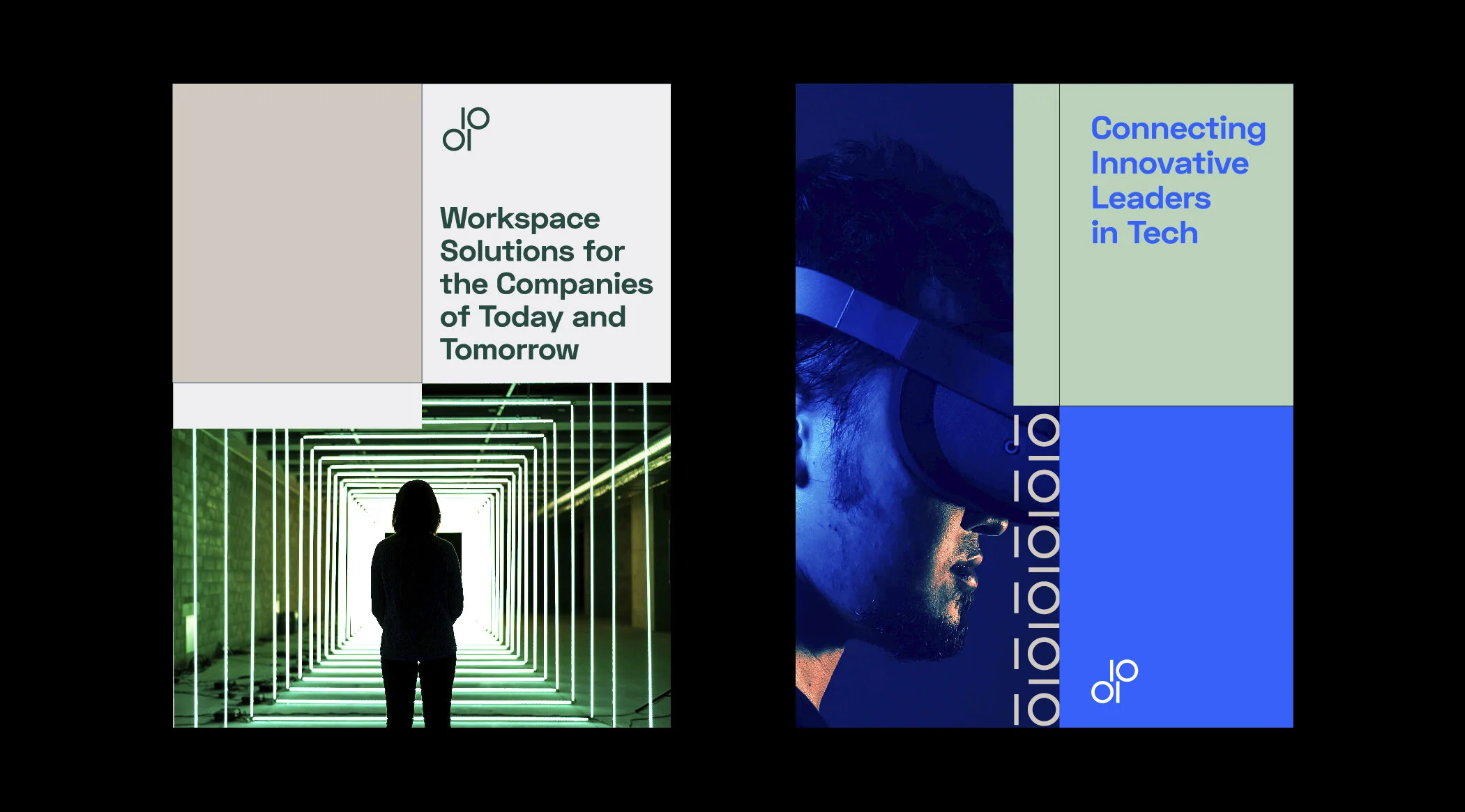
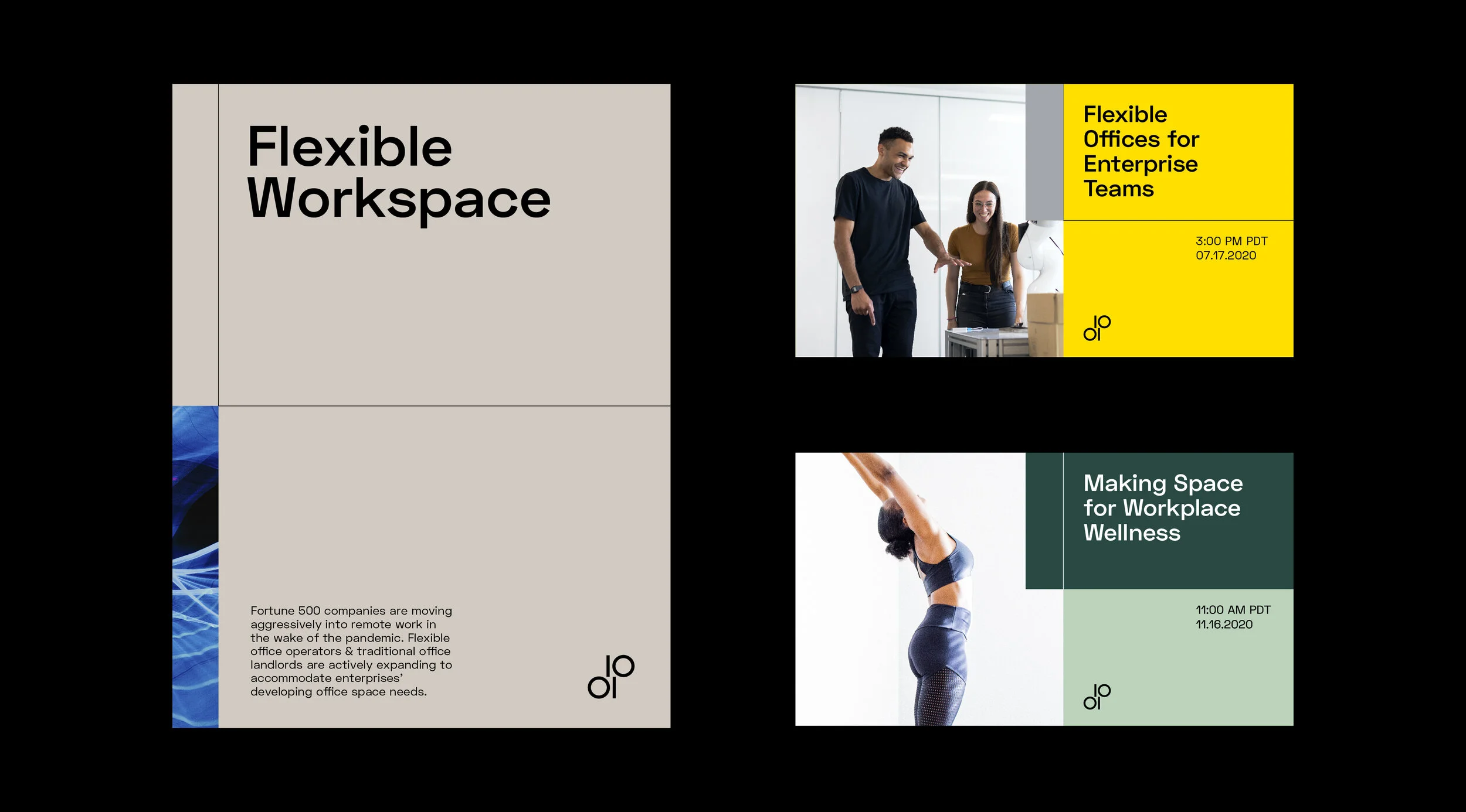
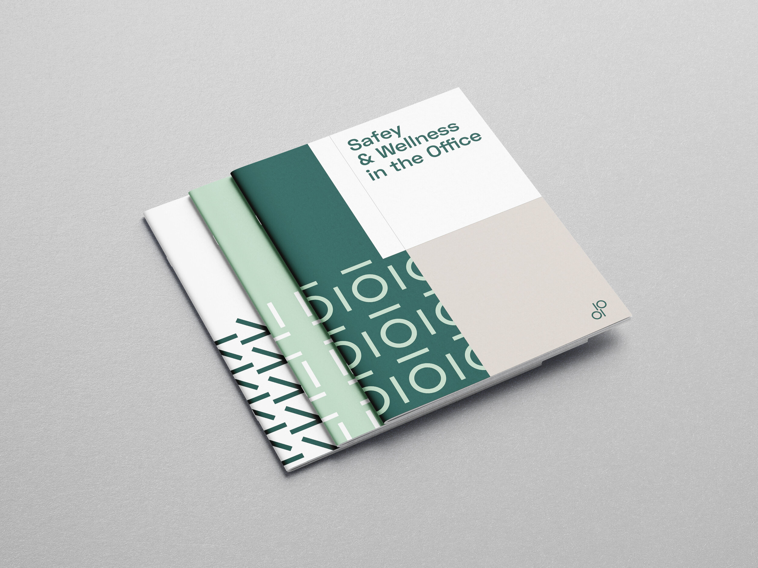
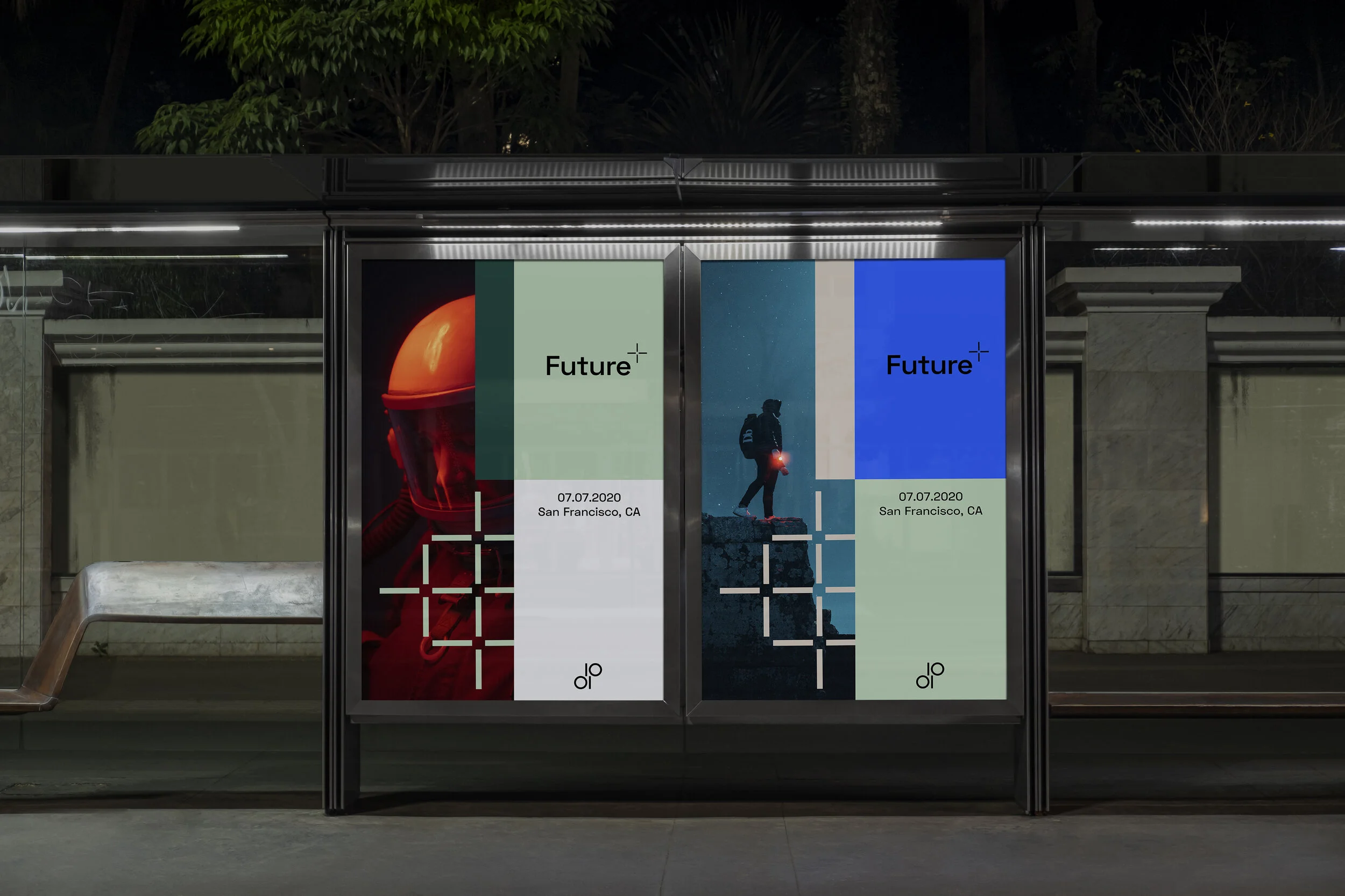
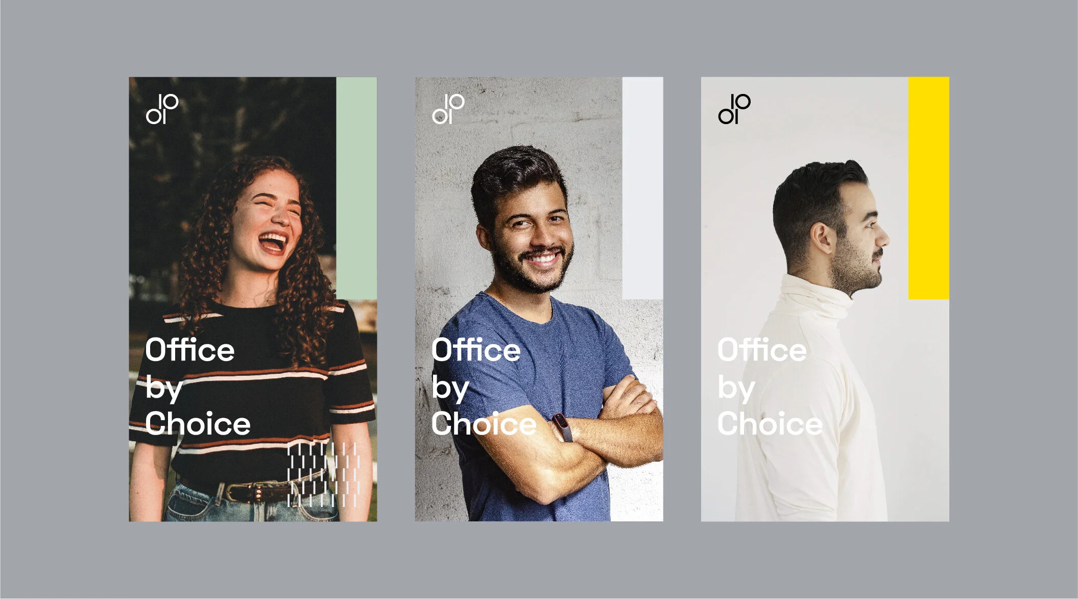
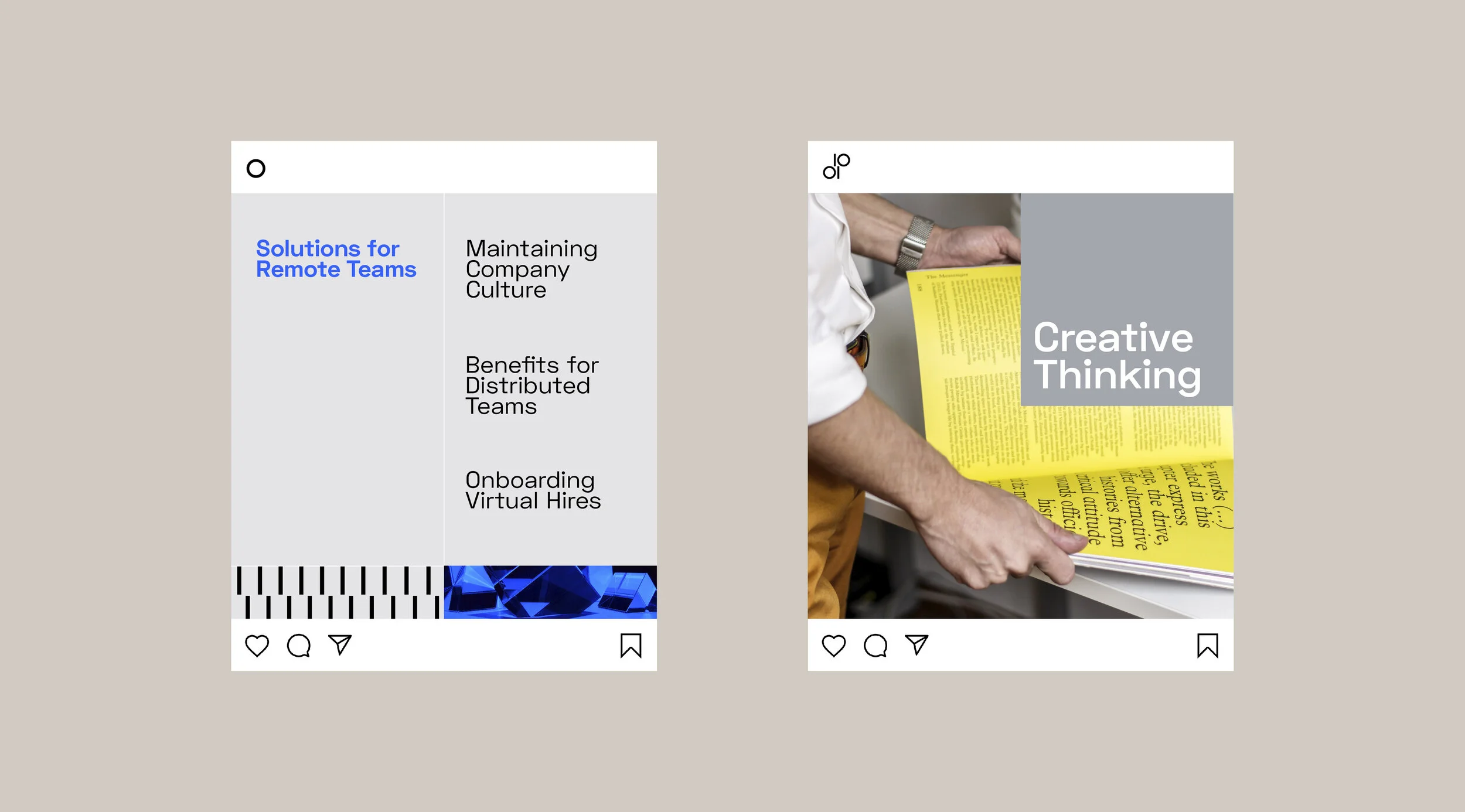
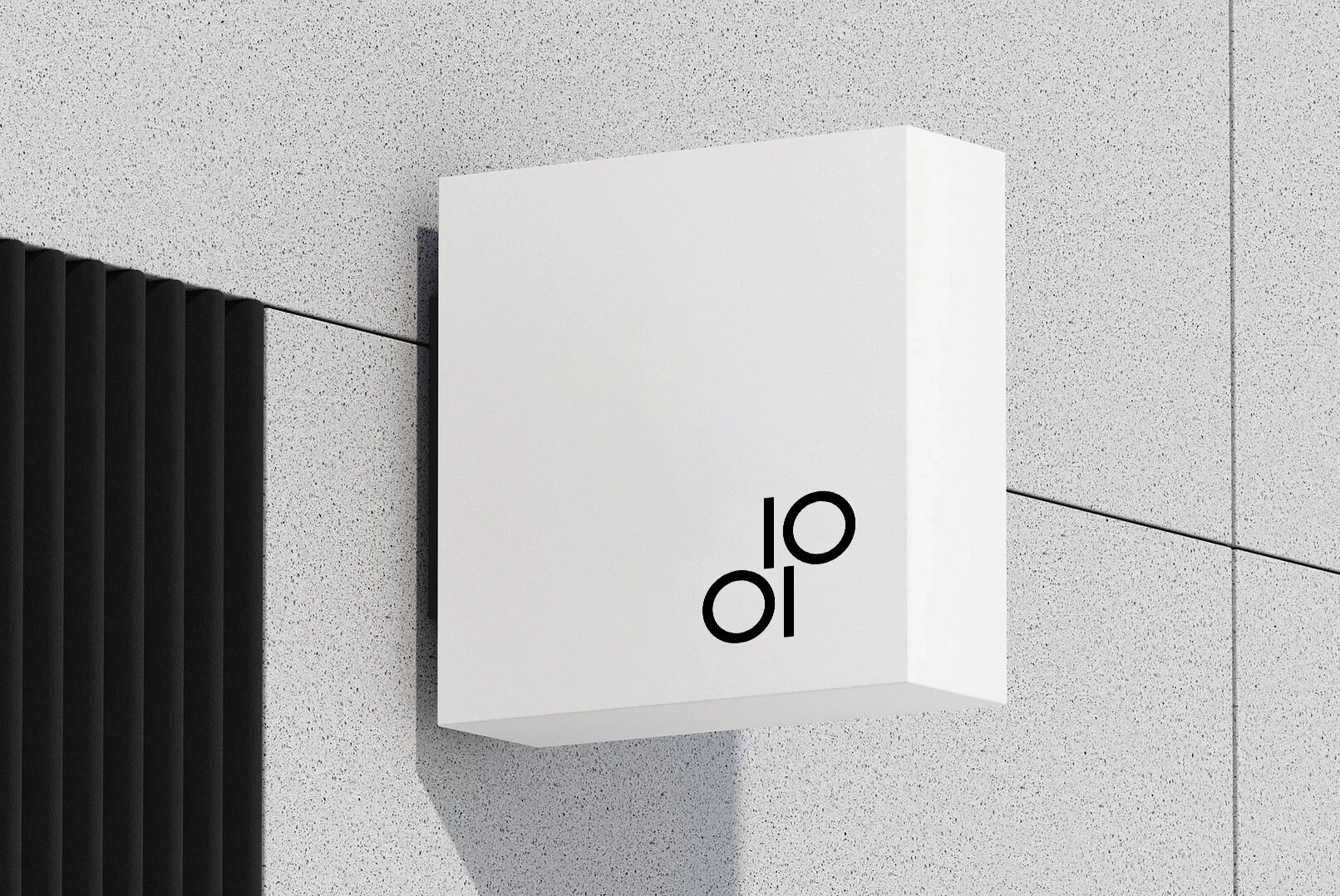
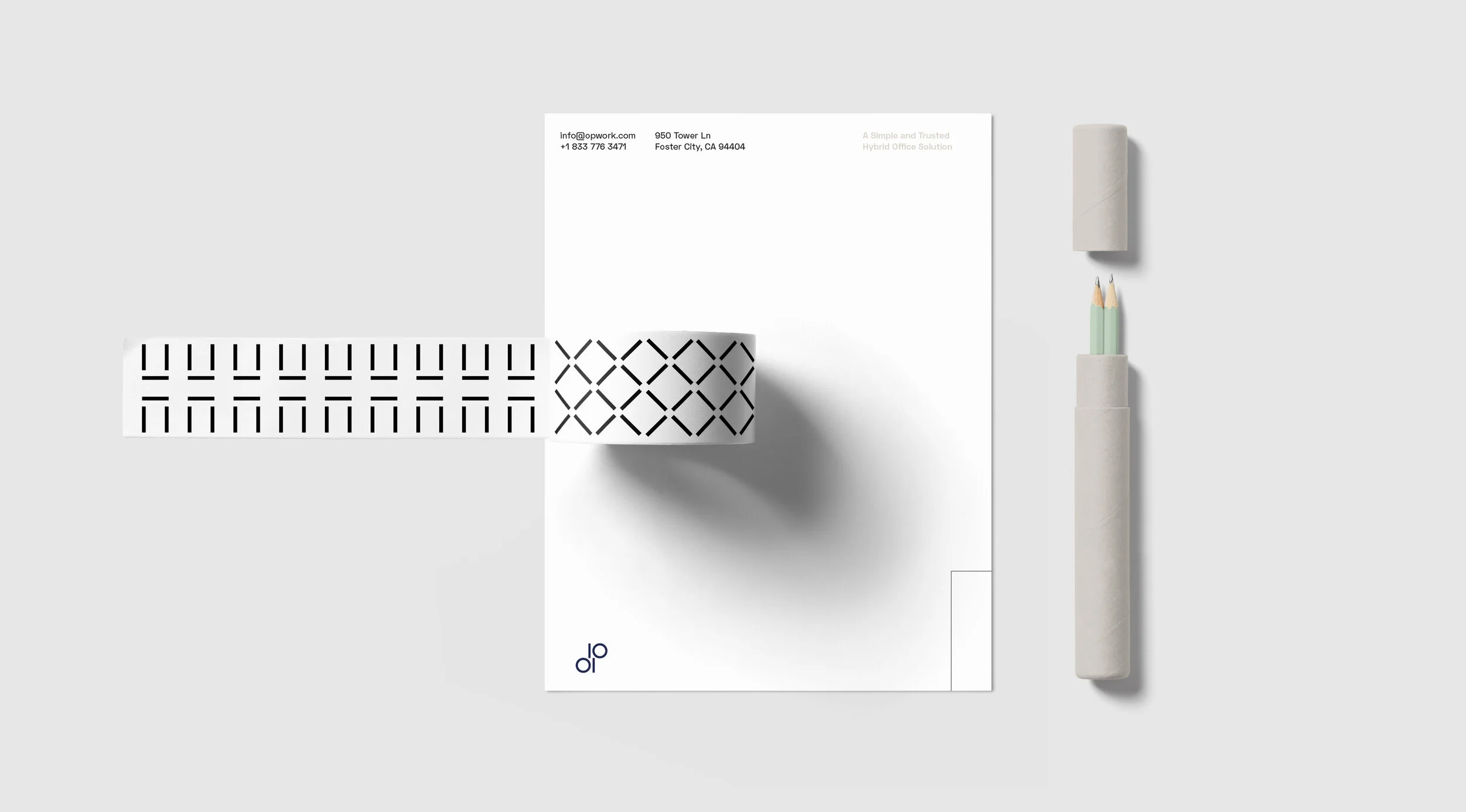
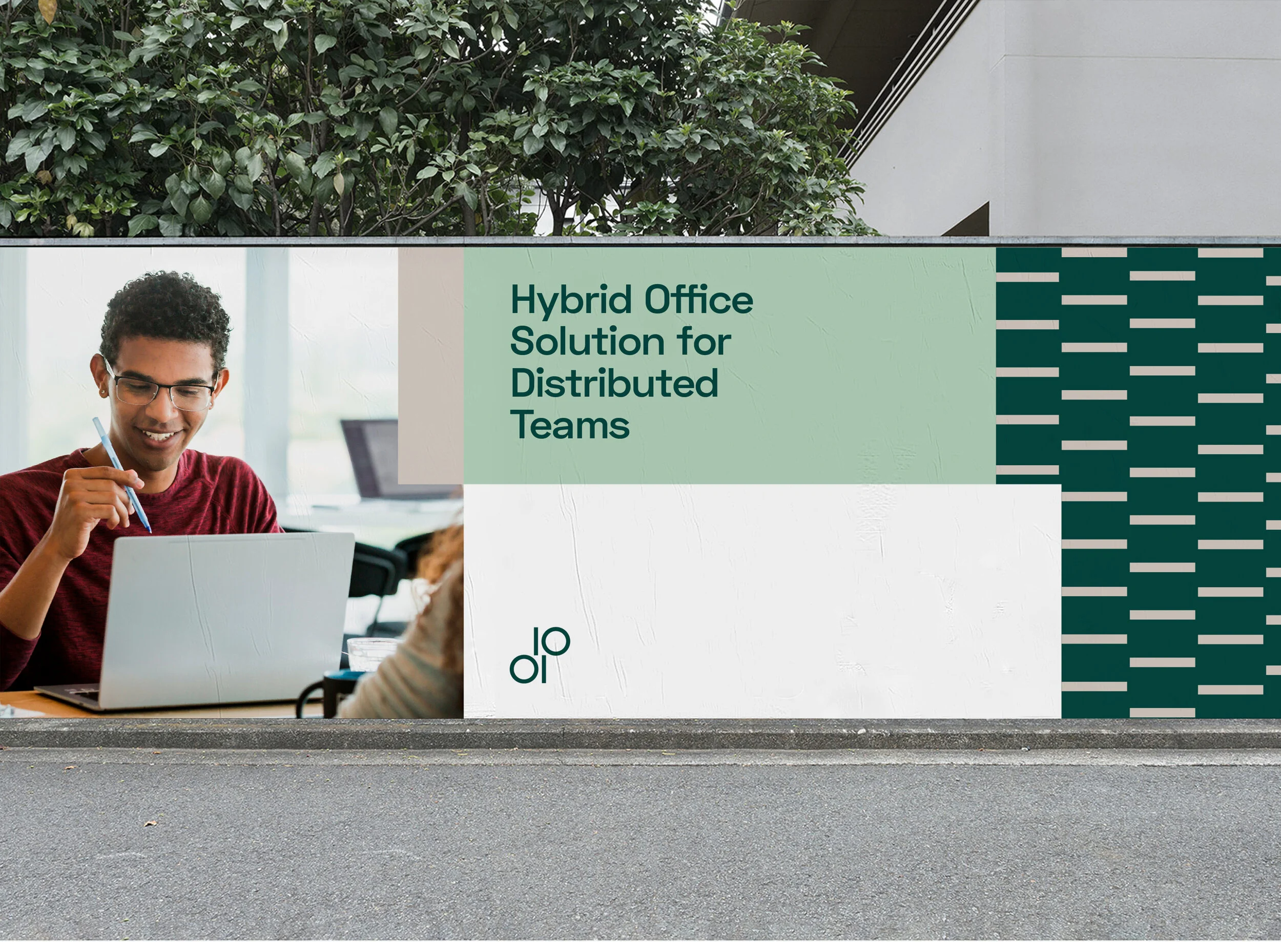
I created a brand identity for OP to position the company as a flexible workspace. As a result, the OP logo is bold, simple, and memorable. The letters “O” and “P” are formed in the binary computer language of “1” and “0,” thus integrating the language of technology into the logo and reflecting OP's attitude of not forgetting its original intentions. Separately, the logo resembles two tables facing each other from an overhead perspective, conveying the core brand message of a flexible workspace. The staggered lines extracted from the logo divide the extremely flexible layout system, which makes the broader system possible in an orderly manner. Considering the international presence of OP, this flexible system allows teams in different markets to relate to audiences with culturally specific content.